One of my main goals while making this website was to get a much better grasp on implementing Responsive Design. For those unaware, this is the methodology of making a website adapt to what it’s being displayed on. It’s what gives mobile users the hamburger icon, while desktop users get the full conventional navbar. So to both cement my knowledge and to maybe help others just starting, here is a nutshell explanation of Responsive Design.
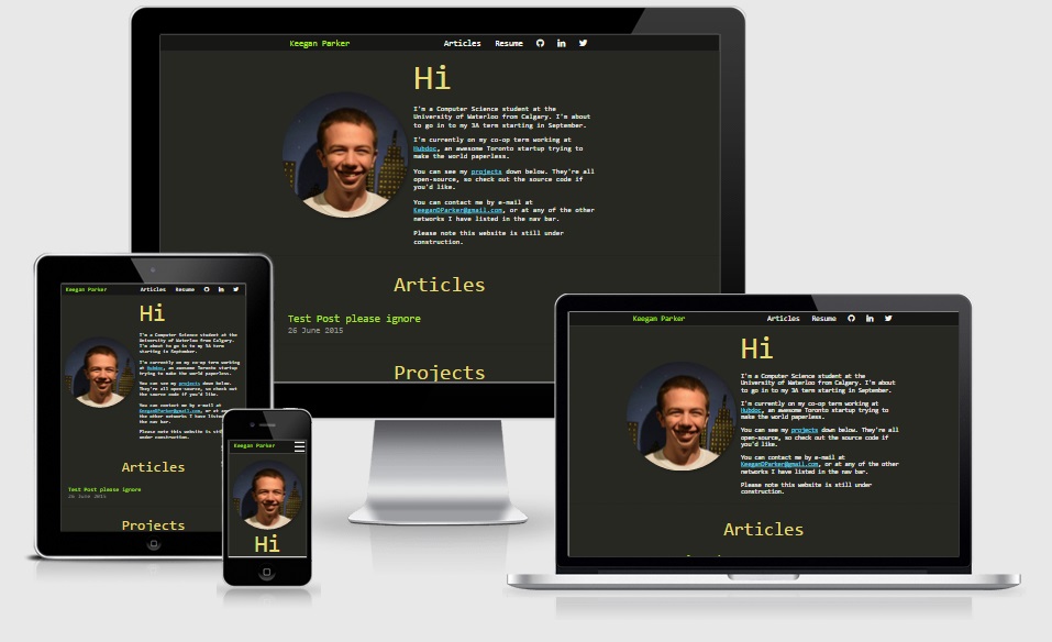 Conventional device size rendering using Am I Responsive?
The Basics
The Viewport Meta Tag
<meta name="viewport" content="width=device-width, initial-scale=1">This sets the viewport size on a device. Include this tag in the header of all of your html pages to make sure that the experience is consistent on all mobile phones.
Relative Widths and calc
.class {
    width: 100%;
    max-width: 640px;
}

#id {
    width: calc(100% - 30px);
    margin: 15px;
}
When setting widths with material design, you always want to use relative widths. If you want margins while using relative widths, use calc with the percentage you want, subtracting the sum of the right and left margin. If you don’t want something to be stretched out (e.g an image), then set the max-width property.
Media Queries
Media queries are essentially if statements in your css. Anything inside of the media query is only ran if the statement is true. The attributes we mostly use are screen, min-width, and max-width: Screen is the display-type of browsers (as opposed to something like print, which is tor print documents off). Min-width and max-width are fairly self-explanatory. Min-width is true if the screen width is at least the set width, while max-width is true if the screen width is not over the set width.
body {
    background-color: red;
}

@media screen and (min-width: 700px) and (max-width: 900px) {
    body {
       background-color: green;
   }
}

@media screen and (max-width: 699px) {
    body {
        background-color: blue;
    }
}
This example just makes it so that the background of the page is red if the window is over 900px wide, green if it’s (inclusively) between 700px and 900px and blue if the screen width is 699px or less. Note we can use the fact that values are overwritten to only use 2 media queries when we could equivalently use 3.
Another notable attribute is orientation, but I haven’t found any particularly important usage for that in my short time with Responsive Design.
Flexboxes
<div class="flex"></div>.flex {
display: -moz-flex;
-moz-flex-direction: row;
display: -webkit-flex;
-webkit-flex-direction: row;
display: flex;
flex-direction: row;
-webkit-flex-wrap: wrap;
flex-wrap: wrap;
}
.flex > div {
display: inline-block;
-webkit-flex-wrap: wrap;
flex-wrap: wrap;
-moz-flex: 1 1 auto;
-webkit-flex: 1 1 auto;
flex: 1 1 auto;
}Flexboxes are divs with the flex display property. Their main use is that they don’t allow overflow, and just move to the next line when they contain a div too wide to fit on the current one. They also order their children based on a css order property. They can also be nested together if you want to keep some objects together.
In the context of responsive design, they mix with media queries where you can adjust the width and order of the contained elements. This makes it so that a picture that should be half the content on desktop could be the full width on mobile.
Example patterns
Centering content with a max-width
<div class="container">
  <div class="content">
     ...
  </div>
</div>
.container {
width: 100%;
}
.content {
width: 100%;
}
@media screen and (min-width: 900px) {
.content {
max-width: 900px;
margin-left: auto;
margin-right: auto;
}
}On large monitors, you generally don’t want content to extend over the entire width of the screen. This is because if it did, most text content would look sparse and stretched out. This simple pattern makes it so that the content window is no larger than 900px, but any lower than that and it takes up the entire screen.
Hamburger drop-down menu
<div class="navbar">
    <div class="nav-content">
        <div class="logo">...</div>
        <div class="hamburger"><a id="menu">...</a></div>
        <div class="navs-container"><ul>
            <li><a>...</a></li>
            <li><a>...</a></li>
            ...
        </ul></div>
    </div>
</div>
.navbar {
width: 100%;
height: 48px;
font-size: 24px;
}
.logo {
display: inline;
float: left;
height: auto;
padding-top: 10px;
padding-bottom: 10px;
}
.navbar a {
padding: 10px;
padding-left: 20px;
padding-right: 20px;
}
.navs-container {
display: inline;
float: right;
padding: 10px;
padding-right: 0px;
}
.navs-container ul {
display:inline;
height: auto;
padding: 0px;
margin: 0px;
/* Makes it so that we don't have gaps between list elements */
list-style: none;
font-size: 0px;
}
.navs-container li {
font-size: 24px;
display: inline;
padding-top: 10px;
padding-bottom: 10px;
}
@media screen and (max-width: 670px) {
.navs-container {
display: none;
padding: 0;
width: 100%;
}
.navs-container ul {
display: table;
width: 100%;
}
.navs-container li {
width: 100%;
}
.hamburger {
display: inline;
}
}$(document).ready(function() {
$("#menu").on('click', function () {
$(".navs-container").slideToggle();
});
});This creates a navbar with a list of links and a “logo” link that you want displayed on mobile and desktop. On desktop, the list is a horizontal list. On mobile, it will be a dropdown menu that extends/contracts when you click the menu link.
Most of the code here is fairly self-explanatory, but I’d like to note to pay particular attention to the display attributes I’m setting,
If you want to do something to the hamburger icon on click, you can just toggle a class on it whenever it’s pressed. Doing it this way allows css animations too, which sync up well with slideToggle.
Now we are assuming that we are importing jQuery for this, as it provides the nice slideToggle method, but you could equally do this with vanilla JS, it would just be harder to make it look smooth. You should also note that I’ve taken out a lot of stylistic things like colors and hovers to make the code simpler, you will probably want to add these in yourself.
Other Resources
There are a ton of resources for good material design references. Here are a few that I used while making this website, if you’d like to go more in depth in to any of the subjects covered.